ヒストグラムは、matplotlib の hist メソッドで作成できる。入力データは、1 次元の配列として与える。
import numpy as np
import matplotlib.pyplot as plt
import seaborn as sns

sns.set()
sns.set_style('whitegrid')
sns.set_palette('gray')

np.random.seed(2018)

x = np.random.normal(50, 10, 1000)

fig = plt.figure()
ax = fig.add_subplot(1, 1, 1)
ax.hist(x)
ax.set_xlabel('length [cm]')
plt.show()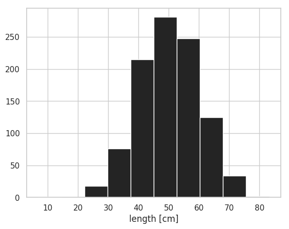
density=True を指定することで、全てのビンの面積の合計値が 1.0 となるようにヒストグラムが描かれる。すべてのビンの高さの合計を 1.0 にするためには自らビンの高さを調整する必要がある。
import numpy as np
import matplotlib.pyplot as plt
import seaborn as sns

sns.set()
sns.set_style('whitegrid')
sns.set_palette('gray')

np.random.seed(2018)

x = np.random.normal(50, 10, 1000)

fig = plt.figure()
ax = fig.add_subplot(1, 1, 1)
ax.hist(x, density=True)
ax.set_xlabel('length [cm]')
plt.show()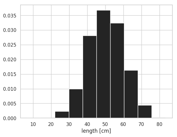
ヒストグラムの本数は bin で指定できる。また、横軸の範囲は range で調整できる。
import numpy as np
import matplotlib.pyplot as plt
import seaborn as sns

sns.set()
sns.set_style('whitegrid')
sns.set_palette('gray')

np.random.seed(2018)

x = np.random.normal(50, 10, 1000)

fig = plt.figure()
ax = fig.add_subplot(1, 1, 1)
ax.hist(x, bins=16, range=(40, 80))
ax.set_xlabel('length [cm]')
plt.show()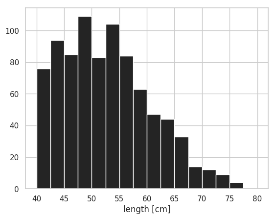
2 つのヒストグラムを重ねて描きたい場合は、hist を 2 回実行すれば良い。ヒストグラムの塗りを透明化 alpha させることで、2 つのヒストグラムが重なっても両方が見えるようになる。また、ほとんどの場合、デフォルトでは、2 つのヒストグラムの幅は重ならないが、bins と range を変えて試行錯誤することで、きれいに重なるようなヒストグラムを作図できる。
import numpy as np
import matplotlib.pyplot as plt
import seaborn as sns

sns.set()
sns.set_style('whitegrid')
sns.set_palette('Set1')

np.random.seed(2018)

x1 = np.random.normal(40, 10, 1000)
x2 = np.random.normal(80, 20, 1000)

fig = plt.figure()
ax = fig.add_subplot(1, 1, 1)
ax.hist(x1, bins=50, alpha=0.6)
ax.hist(x2, bins=50, alpha=0.6)
ax.set_xlabel('length [cm]')
plt.show()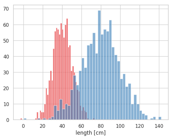
2 つのヒストグラムを重ねずに隣り合う形で描くは、2 つのヒストグラムのデータをリストの形で hist に与える。
import numpy as np
import matplotlib.pyplot as plt
import seaborn as sns

plt.style.use('default')
sns.set()
sns.set_style('whitegrid')
sns.set_palette('Set1')

np.random.seed(2018)

x1 = np.random.normal(40, 10, 1000)
x2 = np.random.normal(80, 20, 1000)

fig = plt.figure()
ax = fig.add_subplot(1, 1, 1)
ax.hist([x1, x2], bins=50)
ax.set_xlabel('length [cm]')

plt.show()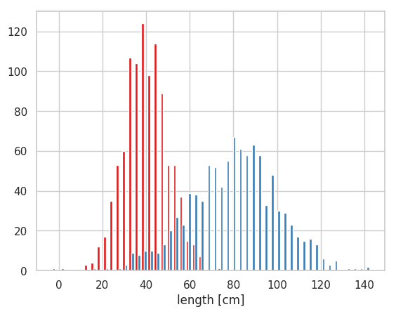
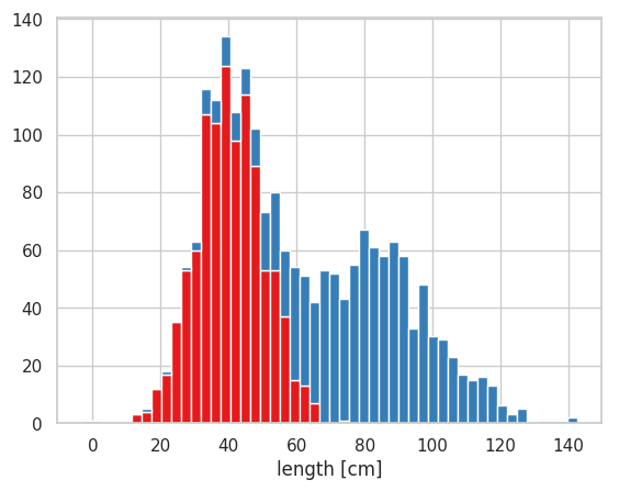
2 つのヒストグラムを積み上げて描くこともできる。このときも複数のヒストグラムの入力データをリストの形式で与える。その際、hist のオプションを stacked=True として指定する必要がある。
import numpy as np
import matplotlib.pyplot as plt
import seaborn as sns

plt.style.use('default')
sns.set()
sns.set_style('whitegrid')
sns.set_palette('Set1')

np.random.seed(2018)

x1 = np.random.normal(40, 10, 1000)
x2 = np.random.normal(80, 20, 1000)

fig = plt.figure()
ax = fig.add_subplot(1, 1, 1)
ax.hist([x1, x2], bins=50, stacked=True)

plt.show()