円グラフは割合データを視覚化するのによく利用される。ただ、円グラフは、使い方などによって誤解を招きやすいグラフとなっているため、実際に円グラフを使用する時、棒グラフなどで代替できないかを検討して、できるなら棒グラフなどで代替した方がよい。
Python では matplotlib ライブラリーの pyplot.pie メソッドを使って円グラフを描く。入力データはリストとして与える。
import matplotlib.pyplot as plt
import seaborn as sns
import numpy as np
plt.style.use('default')
sns.set()
sns.set_style('whitegrid')
sns.set_palette('Set2')
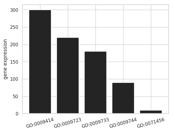
x = ['GO:0009414', 'GO:0009723', 'GO:0009733', 'GO:0009744', 'GO:0071456']
y = np.array([300, 220, 180, 90, 10])
fig = plt.figure()
ax = fig.add_subplot(1, 1, 1)
ax.pie(y, labels=x, autopct="%1.1f%%")
plt.show()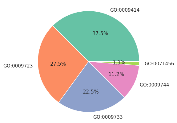
また、円グラフの中心を白で塗りつぶすことで、ドーナツ型の円グラフを仕上げることができる。
import matplotlib.pyplot as plt
import seaborn as sns
import numpy as np

plt.style.use('default')
sns.set()
sns.set_style('whitegrid')
sns.set_palette('Dark2')

x = ['GO:0009414', 'GO:0009723', 'GO:0009733', 'GO:0009744', 'GO:0071456']
y = np.array([300, 220, 180, 90, 10])

plt.pie(y, labels=x)
plt.gca().add_artist(plt.Circle((0, 0), 0.65, color='white'))
plt.axis('equal')

plt.show()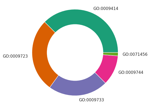
円グラフを棒グラフで代替できる場合もあるので、棒グラフを使った方がわかりやすい場合がある。例えば、割合データでも、次のように棒グラフで絶対数を示した方がデータをより正確に表せる。