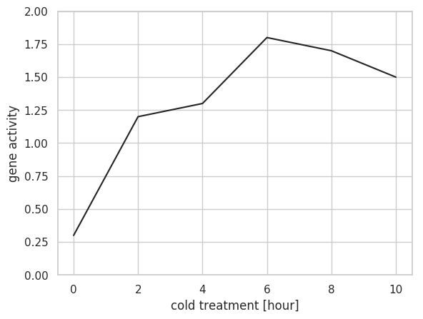
線グラフは plot で作図する。基本的に plot メソッドに x 座標のデータと y 座標のデータを与えるだけで作図できる。グラフの軸範囲は、入力データに応じて自動的に決められるため、入力データに 0 が含まれない時は、原点が描かれない。原点を描きたい場合は ylim と xlim で指定する。
import matplotlib.pyplot as plt
import seaborn as sns
import numpy as np

sns.set()
sns.set_style('whitegrid')
sns.set_palette('gray')

x = np.array([0, 2, 4, 6, 8, 10])
y = np.array([0.3, 1.2, 1.3, 1.8, 1.7, 1.5])

fig = plt.figure()
ax = fig.add_subplot(1, 1, 1)
ax.plot(x, y)
ax.set_xlabel('cold treatment [hour]')
ax.set_ylabel('gene activity')
ax.set_ylim(0, 2)
plt.show()
複数の線グラフを描きたい場合は、それぞれのデータに対して、plot メソッドを実行する。この際、グラフの色は特に指定しない限り、カラーパレットに従い、自動的に振り分けられる。ここでは seaborn の Set1 のカラーパレットを使用した。
import matplotlib.pyplot as plt
import seaborn as sns
import numpy as np
import pandas as pd

plt.style.use('default')
sns.set()
sns.set_style('whitegrid')
sns.set_palette('Set1')

x = np.array([0, 2, 4, 6, 8, 10])
gene_1 = np.array([0.3, 1.2, 1.3, 1.8, 1.7, 1.5])
gene_2 = np.array([2.1, 2.4, 2.3, 2.1, 2.2, 2.1])
gene_3 = np.array([0.3, 0.6, 1.1, 1.8, 2.2, 2.8])


fig = plt.figure()
ax = fig.add_subplot(1, 1, 1)

ax.plot(x, gene_1, label='gene 1')
ax.plot(x, gene_2, label='gene 3')
ax.plot(x, gene_3, label='gene 3')

ax.legend()
ax.set_xlabel("time [hour]")
ax.set_ylabel("gene expression [log(TPM)]")
ax.set_ylim(0, 3)

plt.show()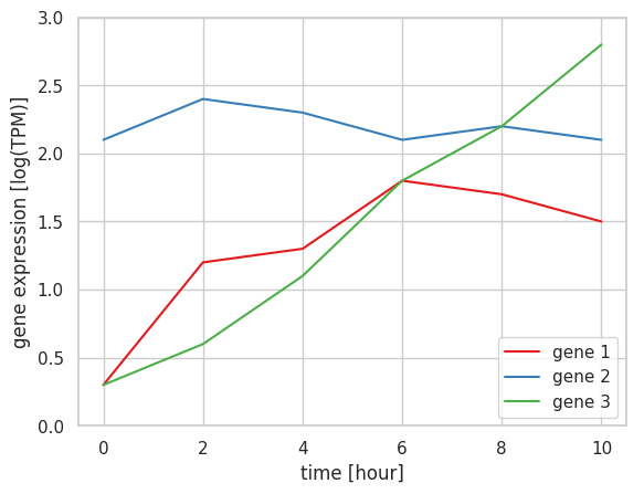
plot メソッドの marker オプションを使用することによって、実際にデータがある箇所には点などのマーカーが描かれるようになる。
import matplotlib.pyplot as plt
import seaborn as sns
import numpy as np
import pandas as pd

plt.style.use('default')
sns.set()
sns.set_style('whitegrid')
sns.set_palette('Set1')

x = np.array([0, 2, 4, 6, 8, 10])
gene_1 = np.array([0.3, 1.2, 1.3, 1.8, 1.7, 1.5])
gene_2 = np.array([2.1, 2.4, 2.3, 2.1, 2.2, 2.1])
gene_3 = np.array([0.3, 0.6, 1.1, 1.8, 2.2, 2.8])

df = pd.DataFrame({
    'x': x, 'gene1': gene_1, 'gene2': gene_2, 'gene3': gene_3
})

fig = plt.figure()
ax = fig.add_subplot(1, 1, 1)

ax.plot('x', 'gene1', data=df, label='gene 1', marker='o')
ax.plot('x', 'gene2', data=df, label='gene 3', marker='o')
ax.plot('x', 'gene3', data=df, label='gene 3', marker='o')

ax.legend()
ax.set_xlabel("time [hour]")
ax.set_ylabel("gene expression [log(TPM)]")
ax.set_ylim(0, 3)
plt.show()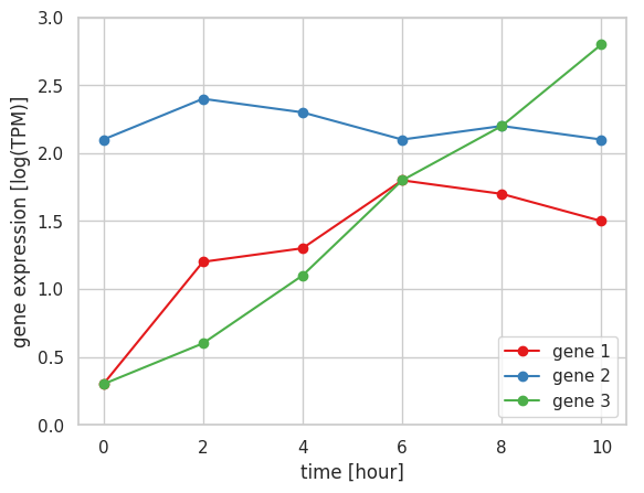
エラーバー付きの線グラフを描くとき、errorbar メソッドを利用する。最初の 2 つの引数に x 座標と y 座標を与えて、yerr オプションにあらかじめ計算した誤差あるいは標準偏差を与える。ただ、errorbar メソッドのデフォルトの設定では、エラーバーが縦棒となっているので、「工」の形にするために capthick, capsize, lw を 0 以上の値に指定しておく必要がある。
import matplotlib.pyplot as plt
import seaborn as sns
import numpy as np
import pandas as pd

plt.style.use('default')
sns.set()
sns.set_style('whitegrid')
sns.set_palette('gray')

x = np.array([0, 2, 4, 6, 8, 10])
y = np.array([8, 12, 13, 14, 16, 12])
e = np.array([0.8, 0.9, 0.5, 1.1, 1.4, 1.2])

fig = plt.figure()
ax = fig.add_subplot(1, 1, 1)

ax.plot(x, y)
ax.errorbar(x, y, yerr=e, marker='o', capthick=1, capsize=10, lw=1)

ax.set_xlabel("time [hour]")
ax.set_ylabel("gene expression [log(TPM)]")
ax.set_ylim(0, 20)

plt.show()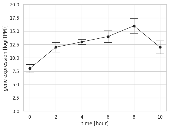
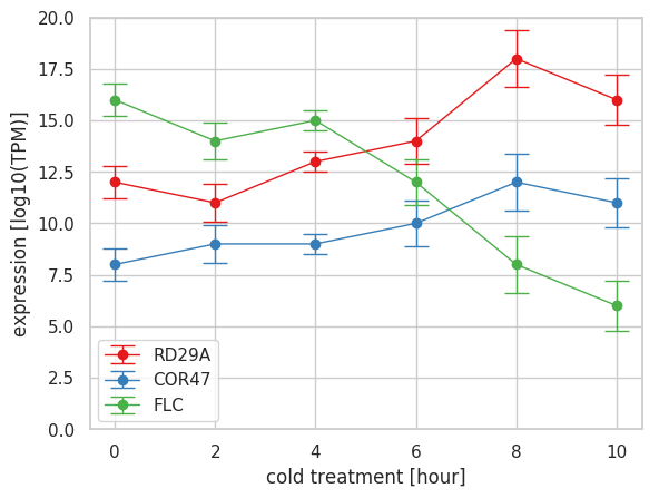
複数のエラーバー付きの線グラフを描く時、それぞれのデータセットに対して errorbar メソッドを適用していけばよい。この際、各データセットに対して、エラーバーの幅となる誤差あるいは標準偏差を与える必要がある。
import matplotlib.pyplot as plt
import seaborn as sns
import numpy as np
import pandas as pd

plt.style.use('default')
sns.set()
sns.set_style('whitegrid')
sns.set_palette('Set1')

x = np.array([0, 2, 4, 6, 8, 10])

y1 = np.array([12, 11, 13, 14, 18, 16])
e1 = np.array([0.8, 0.9, 0.5, 1.1, 1.4, 1.2])

y2 = np.array([8, 9, 9, 10, 12, 11])
e2 = np.array([0.3, 0.4, 0.3, 0.6, 0.8, 0.7])

y3 = np.array([16, 14, 15, 12, 8, 6])
e3 = np.array([1.2, 1.1, 1.2, 0.9, 0.4, 0.3])

fig = plt.figure()
ax = fig.add_subplot(1, 1, 1)

ax.errorbar(x, y1, yerr=e1, marker='o', label='RD29A', capthick=1, capsize=8, lw=1)
ax.errorbar(x, y2, yerr=e2, marker='o', label='COR47', capthick=1, capsize=8, lw=1)
ax.errorbar(x, y3, yerr=e3, marker='o', label='FLC', capthick=1, capsize=8, lw=1)

ax.set_ylim(0, 20)
ax.set_xlabel('cold treatment [hour]')
ax.set_ylabel('expression [log10(TPM)]')

ax.legend()
plt.show()