Python の matplotlib モジュールを利用して描いた三次元散布図の例。subplot を追加する際に projection = '3d' を与えて、ax.scatter に x, y, z の座標をを与えればよい。
import matplotlib
import matplotlib.pyplot as plt
from mpl_toolkits.mplot3d import Axes3D
import matplotlib.cm as cmx

x = [1, 1, 2, 2, 3, 3, 4, 4, 5, 5, 1, 1, 2, 2, 3, 3, 4, 4, 5, 5, 1, 1, 2, 2, 3, 3, 4, 4, 5, 5]
y = [1, 1, 1, 1, 1, 1, 1, 1, 1, 1, 2, 2, 2, 2, 2, 2, 2, 2, 2, 2, 3, 3, 3, 3, 3, 3, 3, 3, 3, 3]
z = [1, 2, 1, 2, 1, 2, 1, 2, 1, 2, 1, 2, 1, 2, 1, 2, 1, 2, 1, 2, 1, 2, 1, 2, 1, 2, 1, 2, 1, 2]
s = [10, 0, 21, 0, 0, 41, 0, 32, 0, 0, 0, 16, 0, 84, 0, 0, 40, 0, 95, 13, 0, 0, 31, 84, 0, 0, 0, 15, 64, 0]


cm_heat = plt.cm.get_cmap('Blues')

fig = plt.figure()
ax = fig.add_subplot(111, projection = '3d')
ax.set_axis_bgcolor('#FFFFFF')
ax.patch.set_facecolor('#FFFFFF')
ax.w_xaxis.set_pane_color((1.0, 1.0, 1.0, 1.0))
ax.w_yaxis.set_pane_color((1.0, 1.0, 1.0, 1.0))
ax.w_zaxis.set_pane_color((1.0, 1.0, 1.0, 1.0))

ax_scatter_obj = ax.scatter(x, y, z, s = s, c = s, cmap = cm_heat)
fig.colorbar(ax_scatter_obj)

x_axis = [0, 1, 2, 3, 4, 5]
y_axis = [0, 1, 2, 3]
z_axis = [0, 1, 2]
ax.set_xticks(x_axis)
ax.set_yticks(y_axis)
ax.set_zticks(z_axis)

ax.grid(False)
for x in x_axis:
    for y in y_axis:
        ax.plot([x, x], [y, y], [min(z_axis), max(z_axis)], ls = 'solid', c = '#A2A2A2', lw = 0.1)
for x in x_axis:
    for z in z_axis:
        ax.plot([x, x], [min(y_axis), max(y_axis)], [z, z], ls = 'solid', c = '#A2A2A2', lw = 0.1)
for y in y_axis:
    for z in z_axis:
        ax.plot([min(x_axis), max(x_axis)], [y, y], [z, z], ls = 'solid', c = '#A2A2A2', lw = 0.1)


ax.view_init(elev = 12, azim = 120)


plt.show()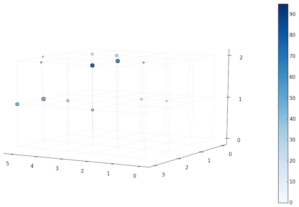
plt.cm.get_cmap を利用してカラーマップを指定することができる。選択できるカラーマップ一覧は matplotlib cm (colormap) のページに表示されている。