散布図は matplotlib の scatter メソッドを利用して描く。基本的に、x 座標と y 座標を代入するだけ作成できる。
import numpy as np
import matplotlib.pyplot as plt
import seaborn as sns

plt.style.use('default')
sns.set()
sns.set_style('whitegrid')
sns.set_palette('gray')

np.random.seed(2018)

x = np.random.uniform(0, 100, 100)
y = x + np.random.normal(5, 10, 100)

fig = plt.figure()
ax = fig.add_subplot(1, 1, 1)
ax.scatter(x, y)
fig.show()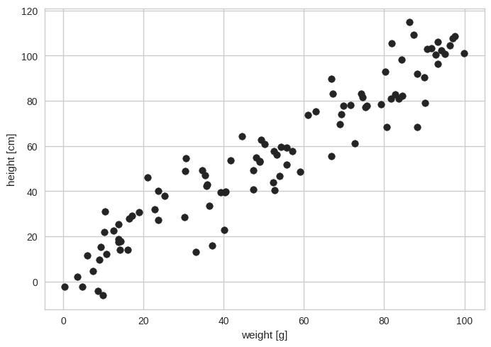
グラフに含まれる点が多いとき、点が重なると 1 つの点として見られる場合が生じる。これを防ぐために、点を透明化させ、重なると濃くなるようにすることができる。透明度は alpha で指定する。
fig = plt.figure()
ax = fig.add_subplot(1, 1, 1)
ax.scatter(x, y, s=200, c="orange", alpha=0.3, linewidths=2, edgecolors="orange")
ax.set_xlabel('weight [g]')
ax.set_ylabel('height [cm]')
fig.show()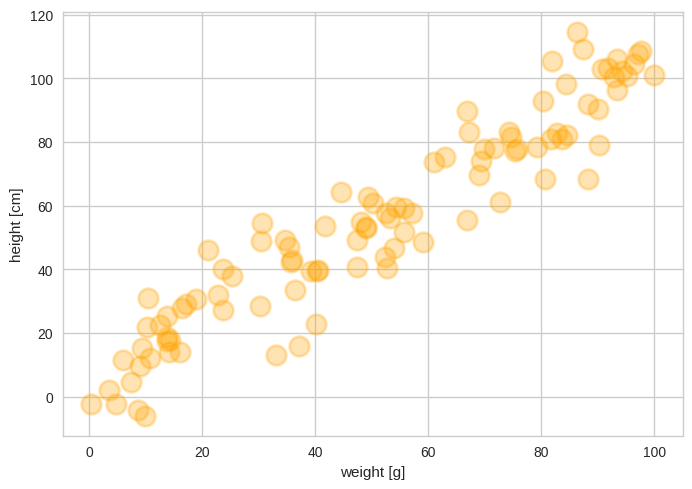
点のサイズを調整することもできる。サイズの調整は s オプションを使用する。
import numpy as np
import matplotlib.pyplot as plt
import seaborn as sns

plt.style.use('default')
sns.set()
sns.set_style('whitegrid')
sns.set_palette('gray')

np.random.seed(2018)

x = np.random.uniform(0, 100, 100)
y = x + np.random.normal(5, 10, 100)
n = np.round(np.random.uniform(10, 500, 100))

fig = plt.figure()
ax = fig.add_subplot(1, 1, 1)
ax.scatter(x, y, s=n, alpha=0.5)

ax.set_xlabel('weight [g]')
ax.set_ylabel('height [cm]')
plt.show()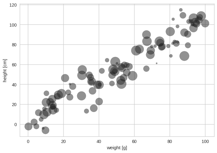
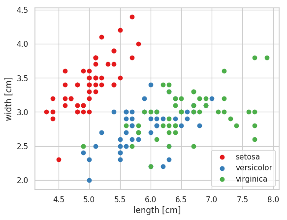
複数の属性からなるデータを散布図に描き、属性ごとに色を塗り分けることもできる。
import numpy as np
import matplotlib.pyplot as plt
import seaborn as sns

plt.style.use('default')
sns.set()
sns.set_style('whitegrid')
sns.set_palette('Set1')

df = sns.load_dataset('iris')
print(df.head())
##    sepal_length  sepal_width  petal_length  petal_width species
## 0           5.1          3.5           1.4          0.2  setosa
## 1           4.9          3.0           1.4          0.2  setosa
## 2           4.7          3.2           1.3          0.2  setosa
## 3           4.6          3.1           1.5          0.2  setosa
## 4           5.0          3.6           1.4          0.2  setosa

fig = plt.figure()
ax = fig.add_subplot(1, 1, 1)
for sp in set(df.species):
    df_species = df[df['species'] == sp]
    ax.scatter(data=df_species, x='sepal_length', y='sepal_width', label='species')
ax.legend(loc='lower right')

ax.set_xlabel('length [cm]')
ax.set_ylabel('width [cm]')
plt.show()