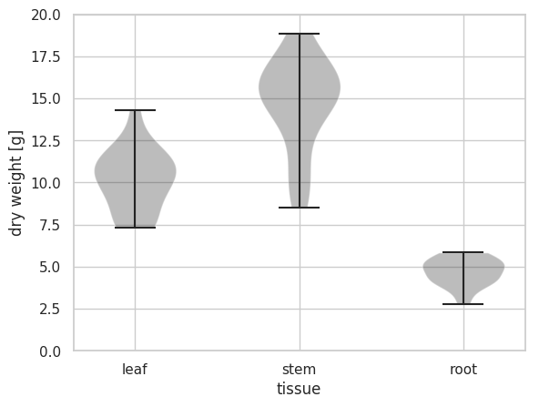
バイオリンプロットは、データの分布の密度を確認できるグラフとなっている。matplotlib ライブラリーの violinplot メソッドを使って描くことができる。入力データとして、リストの形式で与える。
import numpy as  np
from matplotlib import pyplot as plt
import seaborn as sns

plt.style.use('default')
sns.set()
sns.set_style('whitegrid')
sns.set_palette('gray')

np.random.seed(2018)

x1 = np.random.normal(10, 2, 20)
x2 = np.random.normal(15, 3, 20)
x3 = np.random.normal(5, 1, 20)

fig = plt.figure()
ax = fig.add_subplot(1, 1, 1)

ax.violinplot([x1, x2, x3])
ax.set_xticks([1, 2, 3])
ax.set_xticklabels(['leaf', 'stem', 'root'])
ax.set_xlabel('tissue')
ax.set_ylabel('dry weight [g]')
ax.set_ylim(0, 20)
plt.show()
seaborn ライブラリーの violinplot メソッドを使うと、次のように描ける。このとき、入力データとして Pandas のデータフレーム型で与えると、処理しやすい。
import numpy as np
import pandas as pd
from matplotlib import pyplot as plt
import seaborn as sns

plt.style.use('default')
sns.set()
sns.set_style('whitegrid')
sns.set_palette('gray')

np.random.seed(2018)

df = pd.DataFrame({
    'leaf': np.random.normal(10, 2, 20),
    'stem': np.random.normal(15, 3, 20),
    'root': np.random.normal(5, 1, 20)
})

df_melt = pd.melt(df)
print(df_melt.head())
##   variable      value
## 0     leaf   9.446465
## 1     leaf  11.163702
## 2     leaf  14.296799
## 3     leaf   7.441026
## 4     leaf  11.004554

fig = plt.figure()
ax = fig.add_subplot(1, 1, 1)

sns.violinplot(x='variable', y='value', data=df_melt, jitter=True, color='gray', ax=ax)

ax.set_xlabel('tissue')
ax.set_ylabel('dry weight [g]')
ax.set_ylim(0, 25)
plt.show()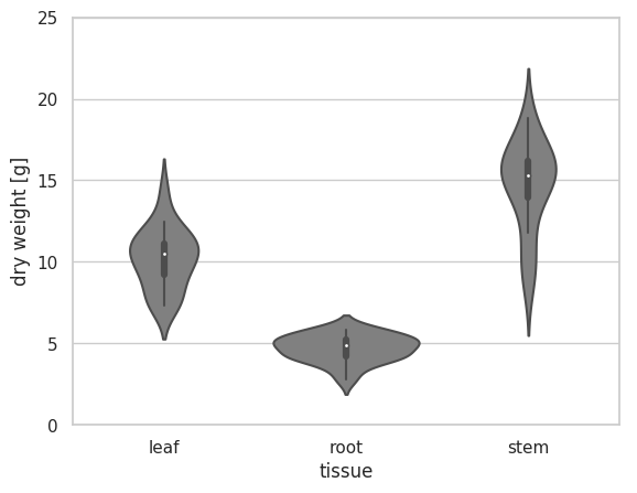
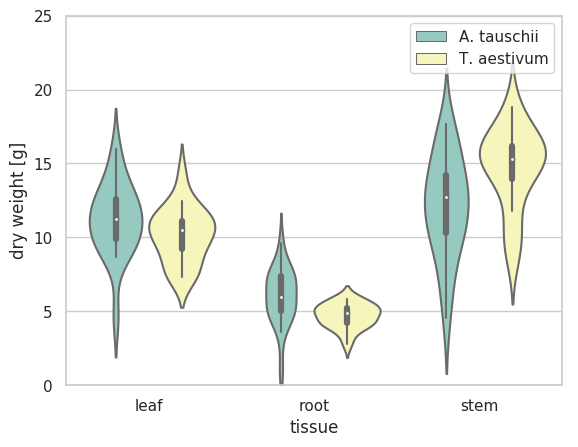
複数の属性を持つようなデータに対して、matplotlib ではなく、seaborn ライブラリーの violinplot メソッドを使うと簡単に描ける。このとき、入力データとして Pandas のデータフレーム型で与えると、処理しやすい。
import numpy as np
import pandas as pd
from matplotlib import pyplot as plt
import seaborn as sns

plt.style.use('default')
sns.set()
sns.set_style('whitegrid')
sns.set_palette('Set3')

np.random.seed(2018)

# data of Ta (T. aestivum) group
dfTa = pd.DataFrame({
    'leaf': np.random.normal(10, 2, 20),
    'stem': np.random.normal(15, 3, 20),
    'root': np.random.normal(5, 1, 20)
})

# data of At (A. tauschii) group
dfAt = pd.DataFrame({
    'leaf': np.random.normal(12, 3, 20),
    'stem': np.random.normal(12, 3, 20),
    'root': np.random.normal(6, 2, 20)
})


dfTa_melt = pd.melt(dfTa)
dfTa_melt['species'] = 'T. aestivum'
dfAt_melt = pd.melt(dfAt)
dfAt_melt['species'] = 'A. tauschii'

df = pd.concat([dfAt_melt, dfTa_melt], axis=0)

fig = plt.figure()
ax = fig.add_subplot(1, 1, 1)
sns.violinplot(x='variable', y='value', data=df, hue='species', dodge=True,
              jitter=True, color='black', palette='Set3', ax=ax)

ax.set_xlabel('tissue')
ax.set_ylabel('dry weight [g]')
ax.set_ylim(0, 25)
ax.legend()
plt.show()