ggplot2 パッケージの geom_point 関数は点プロットを描く関数である。geom_point 関数はデータの散布図などを描く際に利用される。geom_line などの関数と合わせて用いることで、点と折れ線からなるグラフも描ける。
散布図
仮想のデータを利用して、x 軸に植物の乾燥重量、y 軸に結実数を点グラフで示す。
library(ggplot2)

x <- data.frame(
    weight = c(1.2, 1.5, 1.1, 1.6, 1.6, 1.4, 1.3, 0.9, 1.1),
    seeds  = c(26, 31, 19, 34, 38, 23, 24, 21, 24)
)

g <- ggplot(x, aes(x = weight, y = seeds))
g <- g + geom_point()
plot(g)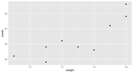
散布図(複数項目)
仮想のデータを利用して、x 軸に植物の乾燥重量、y 軸に結実数を点グラフで示す。植物種として、A 種、B 種と C 種が存在するものとする。種別に色分けしたいので、ggsci カラーパレットを呼び出して利用する。
library(ggplot2)
library(ggsci)

A <- data.frame(
    weight = c(1.2, 1.5, 1.1, 1.6, 1.6, 1.4, 1.3, 0.9, 1.1),
    seeds  = c(26, 31, 19, 34, 38, 23, 24, 21, 24)
)
B <- data.frame(
    weight = c(1.6, 1.7, 1.8, 1.6, 1.5, 1.9, 2.1, 2.1, 2.4),
    seeds  = c(32, 30, 41, 34, 33, 43, 46, 48, 55)
)
C <- data.frame(
    weight = c(1.1, 1.3, 1.6, 1.3, 1.2, 1.9, 1.8, 1.4, 1.7),
    seeds  = c(14, 13, 17, 11, 9, 21, 20, 16, 14)
)

x <- rbind(data.frame(species = "A", A),
           data.frame(species = "B", B),
           data.frame(species = "C", C))

g <- ggplot(x, aes(x = weight, y = seeds, color = species))
g <- g + geom_point()
g <- g + scale_color_nejm()
plot(g)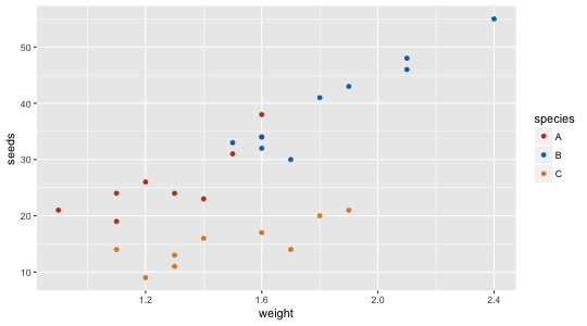
geom_smooth 関数を併用すると、回帰直線も散布図に描き入れることができる。
g <- ggplot(x, aes(x = weight, y = seeds, color = species))
g <- g + geom_point()
g <- g + geom_smooth(method = "lm")
g <- g + scale_color_nejm()
plot(g)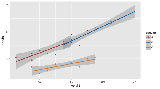
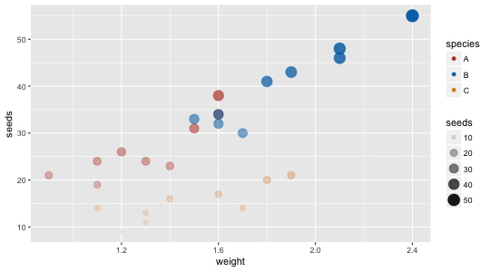
濃淡図
データの値に応じて、点の大きさや透明度を調整することもできる。点の大きさは size、透明度の調整は alpha 引数を使う。
library(ggplot2)
library(ggsci)

A <- data.frame(
    weight = c(1.2, 1.5, 1.1, 1.6, 1.6, 1.4, 1.3, 0.9, 1.1),
    seeds  = c(26, 31, 19, 34, 38, 23, 24, 21, 24)
)
B <- data.frame(
    weight = c(1.6, 1.7, 1.8, 1.6, 1.5, 1.9, 2.1, 2.1, 2.4),
    seeds  = c(32, 30, 41, 34, 33, 43, 46, 48, 55)
)
C <- data.frame(
    weight = c(1.1, 1.3, 1.6, 1.3, 1.2, 1.9, 1.8, 1.4, 1.7),
    seeds  = c(14, 13, 17, 11, 9, 21, 20, 16, 14)
)

x <- rbind(data.frame(species = "A", A),
           data.frame(species = "B", B),
           data.frame(species = "C", C))

g <- ggplot(x, aes(x = weight, y = seeds, size = seeds, alpha = seeds, color = species))
g <- g + geom_point()
g <- g + scale_color_nejm()
plot(g)