ggplot2 を使ってグラフを描くと、グラフの軸は普通の数値 1500 あるいは指数表記 1.5e+04 などのように表示される。これを、1.5×10⁴ のような指数表記にしたい場合は、自分で軸目盛りの表記ラベル作成する必要がある。考え方として、1.5e+04 などの表記を受け取り、e を 10 に置換する、という操作を行って、表記ラベルを作成する。まず、この表記ラベル作成関数を作る。
scientific_notation <- function(x) {
     x <- format(x, scientific = TRUE)
     x <- gsub("^(.*)e", "'\\1'e", x)
     x <- gsub("e", "%*%10^", x)
     x <- gsub('\\+', '', x)
     parse(text = x)
}
次に ggplot2 を利用してグラフをプロットする。指数表示のスタイルを変更したい座標軸にこの関数を代入する。次は y 軸の指数表示を変更する例である。
library(ggplot2)

sample <- rep(c("Sample 1", "Sample 2", "Sample 3"), each = 3)
gene   <- rep(c("V1", "V2", "V3"), times = 3)
freq   <- c(15045, 13400, 9041, 17031, 13095, 10391, 14093, 12050, 9404)

dat <- data.frame(sample = sample, gene = gene, frequency = freq)


g <- ggplot(dat, aes(x = gene, y = frequency, fill = sample))
g <- g + geom_bar(stat = "identity", position = "dodge")
g <- g + scale_y_continuous(labels = scientific_notation)
g <- g + scale_fill_brewer(palette = "Set1")
plot(g)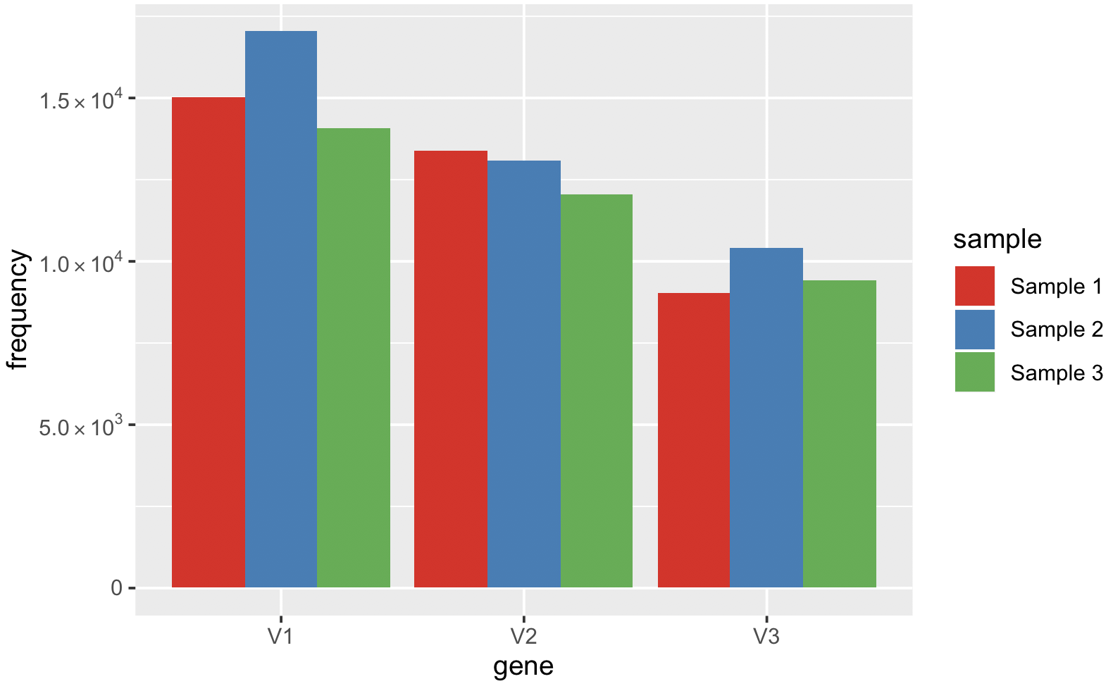
References
- How do I change the formatting of numbers on an axis with ggplot? stack overflow