points 関数を利用した散布図
散布図は、データを直接 plot に与えて描くほかに、points 関数を利用して描くこともできる。次の例では、2 グループのデータを 1 枚の画像に描くために、まず plot 関数で空白な画像を作り、points 関数を 2 回利用して 2 グループのデータを描き加えているサンプルコードである。
x1 <- rnorm(6000, 10, 2)
y1 <- rnorm(6000, 15, 4)
x2 <- rnorm(4000, 20, 3)
y2 <- rnorm(4000, 25, 4)

plot(0, 0, type = "n", xlim = c(0, max(x1, x2)), ylim = c(0, max(y1, y2)),xlab = "x", ylab = "y")

points(x1, y1, col = "darkgrey", pch = 1)
points(x2, y2, col = "orange", pch = 3)

legend("bottomright", legend = c("Group 1", "Group 2"), pch = c(1, 3), col = c("darkgrey", "orange"))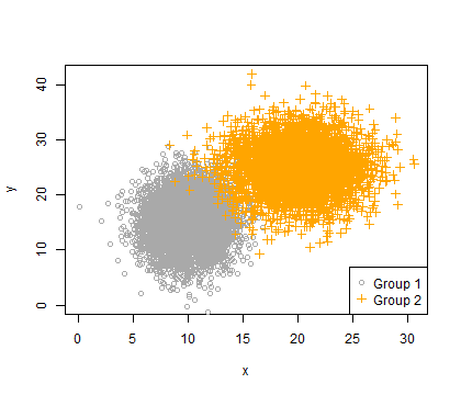
濃淡図の描き方
points 関数で散布図を作成するとき、マーカーの透明度を指定することで、濃淡図を作成できる。例えば、透明度 50% のとき、そこにデータが 1 つしかプロットされていなければ、そこが薄く見える。しかし、同じ領域に複数のデータがプロットされているならば、透明度 50% のマーカーが複数重なるので、その分だけ濃くなる。
RGB 形式で色と透明度を同時に指定できる。例えば「#FF0000」は赤色を表すが、その後ろに 16 進数を付け加えることで(「#FF000020」)、赤色 + 透明度になる。
x1 <- rnorm(6000, 10, 2)
y1 <- rnorm(6000, 15, 4)
x2 <- rnorm(4000, 20, 3)
y2 <- rnorm(4000, 25, 4)

plot(0, 0, type = "n", xlim = c(0, max(x1, x2)), ylim = c(0, max(y1, y2)),xlab = "x", ylab = "y")

points(x1, y1, col = "#30303020", pch = 1)   # grey (#303030) + transparency 32% (20)
points(x2, y2, col = "#ff990020", pch = 3)   # orange (#ff9900) + transparency 32% (20)

legend("bottomright", legend = c("Group 1", "Group 2"), pch = c(1, 3), col = c("#303030", "#ff9900"))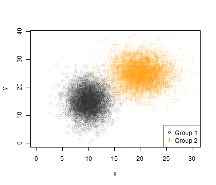
densCols 関数で、グラデーションのカラーパレットを作成することで、散布図をグラデーションカラーで描けるようになる。
x1 <- rnorm(6000, 10, 2)
y1 <- rnorm(6000, 15, 4)
x2 <- rnorm(4000, 20, 3)
y2 <- rnorm(4000, 25, 4)

col1 <- densCols(x1, y1, colramp = colorRampPalette(c("white", "darkgrey")))
col2 <- densCols(x2, y2, colramp = colorRampPalette(c("white", "orange", "red")))

plot(0, 0, type = "n", xlim = c(0, max(x1, x2)), ylim = c(0, max(y1, y2)),xlab = "x", ylab = "y")

points(x1, y1, col = col1, pch = 1)
points(x2, y2, col = col2, pch = 3)

legend("bottomright", legend = c("Group 1", "Group 2"), pch = c(1, 3), col = c("darkgrey", "orange"))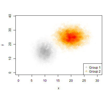
プロットマーカー
プロットマーカーの形は、pch 引数で指定する。プロットマーカーは数値で指定する。数値とプロットマーカーの形は次のように対応している。
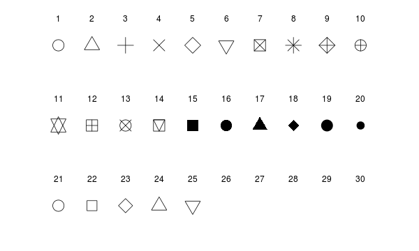
par(mar = c(1, 1, 1, 1))
par(omr = c(1, 1, 1, 1))
plot(0, 0, type = "n", xlim = c(0, 11), ylim = c(0, 8), axes = F, xlab = "", ylab = "")

for (i in 1:10) points(i, 7, cex = 3, pch = i)
for (i in 1:10) text(i, 8, i)

for (i in 1:10) points(i, 4, cex = 3, pch = i+10)
for (i in 1:10) text(i, 5, i + 10)

for (i in 1:10) points(i, 1, cex = 3, pch = i+20)
for (i in 1:10) text(i, 2, i + 20)
プロットマーカーは、数値の代わりに、文字で代用することもできる。
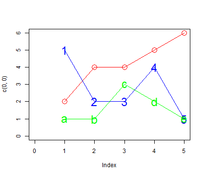
plot(c(0, 0), xlim = c(0, 5), ylim = c(0, 6), type = "n")
x <- c(1, 2, 3, 4, 5)
y1 <- c(2, 4, 4, 5, 6)
y2 <- c(5, 2, 2, 4, 1)
y3 <- c(1, 1, 3, 2, 1)

lines(x, y1, col = "red")
points(x, y1, pch = 1, cex = 2, col = "red")

lines(x, y2, col = "blue")
points(x, y2, pch = as.character(x), cex = 2, col = "blue")

lines(x, y3, col = "green")
points(x, y3, pch = c("a", "b", "c", "d", "e"), cex = 2, col = "green")